Infographic Design Rules

HOW Interactive Design – Bad Inforgraphics
Lately, I’ve come across quite a few articles about infographic design — determining whether or not it is overused and discussing proper usage. Here are two articles and my favorite takeaways:
The Do’s And Don’ts Of Infographic Design from Smashing Magazine.
- Show, Don’t Tell — A rule of cinema is to show, don’t tell. The same holds true for infographic design. The foundation of any good infographic is data viz.
- If the Client Wanted an Excel Chart, They Wouldn’t Need You — It might sound harsh, but it’s true. If infographics were as simple as laying out a bunch of standard charts and graphs on a page, then clients would not need to search out great designers.
- Typography Should Not Be a Crutch — Typography can make or break a design, but it should not be the solution to a data viz problem.
- Tell a Story — All good stories have a beginning, middle and end. Infographics deserve the same treatment. At the beginning of the infographic, introduce the problem or thesis. From there, back it up with data. Finally, end the infographic with a conclusion.
- Visualize the Hook — Every good infographic has a hook or primary takeaway that makes the viewer say “A-ha!” As a designer, you should make this hook the focal point of the design if at all possible. Placing the hook at either the center or very end of the infographic is usually best, so that it grabs more attention.
Quit it With All the Infographics Already from HOW Interactive Design.
- Most infographics aren’t accessible for the visually impaired. The point is to convey information succinctly, right? That info is lost on people who use screen readers if all the text is within an image or if your infographic is Flash-based. If your infographic is readable by low-vision assistance software, does the sequence of the content makes sense to someone who can’t see the graphic?
- Most infographics aren’t search-engine optimized. Likewise, search engines won’t know the content of your flashy chart if it’s all just an image. Malcolm Coles suggests breaking down infographics into HTML and using text or ALT tags for both SEO and accessibility.
- Those super-long infographics are practically useless on a mobile device. I don’t know who started that trend of making infographics approximately 400px wide by 45000px high, but it isn’t a great user experience on an iPhone, and it must stop.
- Of all online infographics, 89% contain statistics of dubious veracity. This is a joke. But with the speed that infographics are appearing online—often about an unquantifiable subject matter and/or produced by an entity trying to make a point—the era of reliable, vetted infographics seems to be over. People might not care if the information in a graphic is correct, but you should.
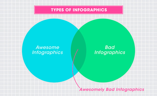
- Many infographics are just plain bad. I don’t want to name names. But sometimes I just don’t know what people were thinking—some situations just don’t call for infographics. (However infographics that are intentionally meaningless can be quite awesome.)
- IF YOU MUST DO IT, DO IT WELL. It’s certainly possible to make infographics that are useful, beautiful and accessible, especially with HTML5.
Here is where you can find some GOOD infographics.
After initially writing this post, I also came across this great video on the subject:
The Value of Data Visualization from Column Five on Vimeo.


HI, this is great, very useful piece of advice and I wonder, do you design infographics yourself at all?